EarShot
Capstone Two for Springboard's UX/UI Bootcamp
EarShot, a fictional music streaming app for my second capstone, required designing a transition from a free to a freemium model. The goals were to enable new users to subscribe to the premium service during registration and to offer returning free users the option to upgrade within the sign-in flow and after logging in.
Description
The project posed a challenge in balancing business and customer needs, as transitioning features from free to paid could frustrate users. The goal was to incentivize premium upgrades while preserving a positive experience for free users. From the research, three problem statements emerged: determining which features should be behind a paywall, how to encourage upgrades without negatively impacting user experience, and ensuring free users do not feel their experience has been diminished.
My role
Research
Prototyping
User Flow
Components
Spotify requires the user to leave the app and login again within a browser to complete the premium transaction. It creates extra work for the user to upgrade.
Wireframing
Research
None of the services seemed to do a great job of enticing the user to upgrade to premium. There were very few prompts letting the user know that there was even such a service.
I decided to conduct some competitive analyses on Pandora, Spotify, and YouTube to see what users have come to expect from premium services. Thanks to my research, I made the following observations:
For their premium services, virtually all streaming companies include: no ads, the ability to download music, the ability to look up and play any song, unlimited skips, and an increase in streaming quality.
Spotify would allow the user to attempt to use a premium feature, only to let them know that they could not accomplish it with a free account.
User Flows
I determined that the two most important red routes were “sign up” and “play a song”. Both routes provide key opportunities to educate users on the perks of having a premium account. The “play a song” route is particularly important because it will be the most commonly utilized route for users. Furthermore, while I want to encourage users to upgrade to a premium plan, I do not want to do it at the cost of a free user’s experience.
Wireframes
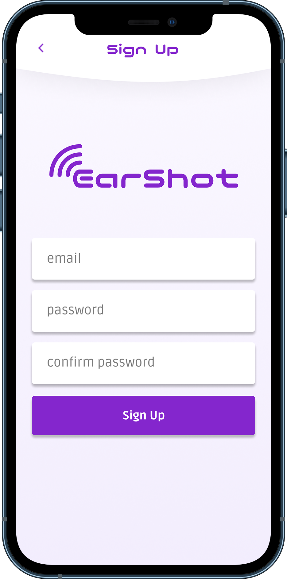
When the user first opens the app, they are presented with onboarding screens which let them know the basic functionality of the app. It also lets them know that EarShot is capable of doing more with a premium subscription. In order to ensure that the user has a good understanding of what they are paying for, I created an information page that lists out all the features of having premium membership. The user is presented with this page after they sign up as well as login. From there they can choose to either keep their free account or upgrade.
There is also a prompt to upgrade to premium when the user attempts to play a song. If a user has a free account, the app creates a radio station based on the searched song rather than play the song itself. However, below the title of the radio station there is a prompt which says “Listen to (Searched Song) now”. When tapped, the prompt takes the user to the premium info page. This allows the app to acknowledge what the user was trying to accomplish while letting them know they will be successful if they use premium.
Brand Platform
Once I completed the wireframes, I started crafting a brand platform and style guide. For the assignment, the company I was designing for was described as “uniquely diverse, but somehow always familiar”. The brand attributes were “bold”, “smart”, and “hip”. I decided to call the app “EarShot” in reference to the fact that it was an audio streaming application. The app’s primary color is purple to create a sense of boldness and creativity. The logo is clean and simple to make the app seem sophisticated and modern. Adding to the sense of modernity is the use of the “Rock Salt” typeface, which appears almost futuristic. For dense paragraph text, I used “Ruda” as the typeface. It looked different enough from typefaces typically used in music apps, but not so different that it seemed unfamiliar.
Final Design
After conducting user research utilizing the prototypes I created earlier, I utilized the feedback to implement changes to the design for the high-fidelity prototype. The biggest changes were made to the premium information page. One of the key aspects that draw users to the idea of a monthly subscription is the idea that they can stop paying at any time. As such, the prototype reminds the user that if they decide they no longer wish to pay for premium, they can easily stop.
The home screen is designed to be easily and quickly readable. It shows the user what their friends are listening to, what they were listening to previously, and new releases. I decided to make the new releases have larger icons than the other categories because they would be frequently changing, requiring the ability to get the user’s attention. The second-largest icons are the icons in the listen again section. This area would be the most frequently used, so ensuring that it was easy to find and accessible was a priority. The section with the largest icons, the new release section, is placed at the bottom. Its large size means it can still be visible even when covered by the “now playing” banner.
The final product uses color and typeface to create a sense of modernity and boldness. It also utilizes key placements of upgrade opportunities to encourage users to purchase a premium account without being too invasive in the free user experience.
Clickable Prototype
More Case Studies


